Working with data can be brutal sometimes. Your spreadsheets alongside the reports buzzing with endless figures, you know the answer is buried somewhere, but the entire exercise can feel like using a candle to find a lightbulb and its switch. Rows and the columns almost become wishfully alive.
This is the point where a decent analytical tool is a necessity. It can depict the figures and answer you them visually. And if you are using a tool like Zoho, then that visualization of data just got a whole lot easier and with more dimensions to play with.
This is also because Zoho has introduced 7 more new types of charts in its visualization toolbox. It’s not just about having more items on a toy shelf. It is more about knowing which tool to use and in which situation. Take for instance a bar chart, sometimes a more simplistic chart is more effective in getting a point across, but you have all the more options to also to have the data processed, fast and correct.
Let’s have a look at these visuals. There’s a lot of technical jargon so I will tell you what each is meant for so you can tell out of the whole collection which is more suited to the task at hand.
1. The Gantt Chart: For When Time is of the essence
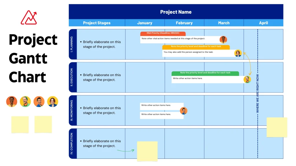
Gantt charts are pretty common in project management, and it features horizontal bars. Each task is denoted by each horizontal bar, and the duration of the task is indicated by the length of the bar.
- What is it used for: The question of, “Where are we at this project, and are we on time?” comes to mind
- Why is it helpful in Zoho Analytics: Thanks to Zoho Analytics, you are now able to take project data straight from Zoho Projects, or even simple spreadsheets and create a live Gantt chart in your dashboard. You are able to visualize dependencies, assignees, and even delays with ease. The feature is great for project health reporting to stakeholders.
2. The Calendar Heatmap: Spotting Patterns Over Time
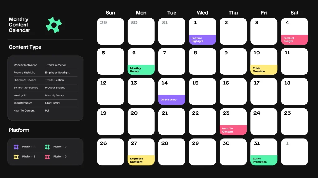
This one is pretty simple and straight forward. It is practically a calendar, with each day filled in based on a number, in this case it could be sales, number of visits to the website, or number of support tickets. The higher the value, the darker the shade.
- What it solves: The question, ‘Are there certain days of a week, or times of a year, when things spike or drop?”
- Why it works with Zoho Analytics: Suppose you are working with e-commerce sales. A line chart may show monthly sales trends, but a calendar heatmap could show you that you see a spike every Tuesday or see a slump on the last Friday of the month. This kind of insight is very valuable for planning marketing initiatives or staff.
3. The Pyramid Chart: Visualizing Hierarchies and Distributions
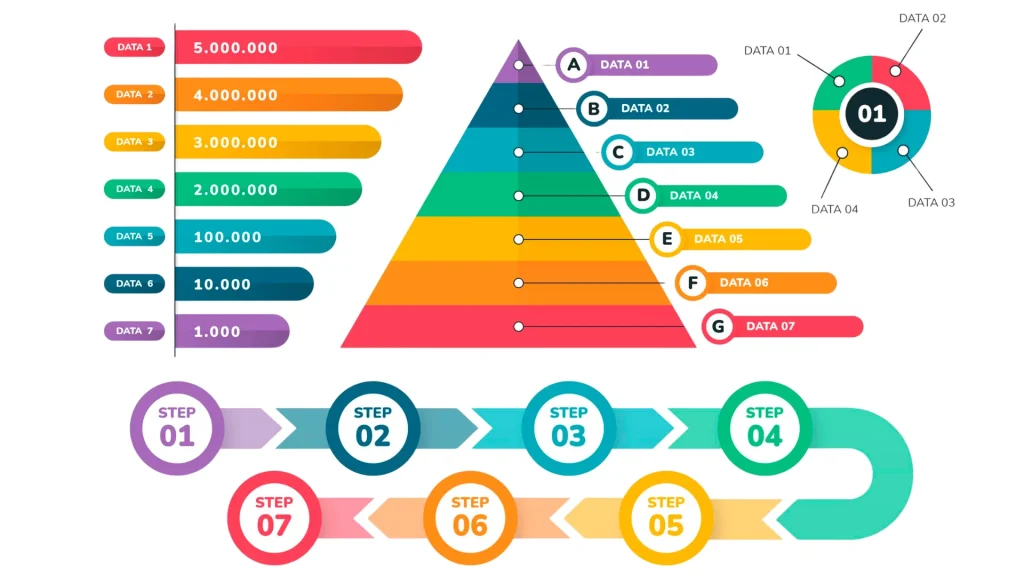
A pyramid chart is an effective tool to depict any hierarchy or proportional figure and one of the most basic is the age and gender population pyramid. It is population data organized in a triangle with the widest section on the bottom, the stacked data forms a triangle.
- What you are solving: The question, “How is the ‘thing’ composed and what are the sizes of the various elements in proportion to one another?”
- Why it’s important in Zoho Analytics: This could be used to show customer segmentation in tiers, where the bottom has a larger pool of casual users, with a taper to a small section of enterprise clients at the top, or visualized as the structure of a sales pipeline of first contact to a closed deal.
4. The Candlestick Chart: A Must-Have for Financial Data
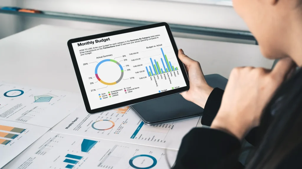
If you handle finance in any of these fields: stocks, commodities, or other instruments that show an open, high, low and close, the chart is very effective in depicting the movement of a security in a given time period set.
- What does it solve: The basic question, “What was the price movement and volatility for this asset during the day?”
- What value does it add to Zoho Analytics: This elevates the financial analysis capability of the Zoho platform. Users can monitor market data, evaluate the performance of their investments, and generate comprehensive financial statements without moving to a different software solution.
5. The Range Area Chart: Showing the Spread
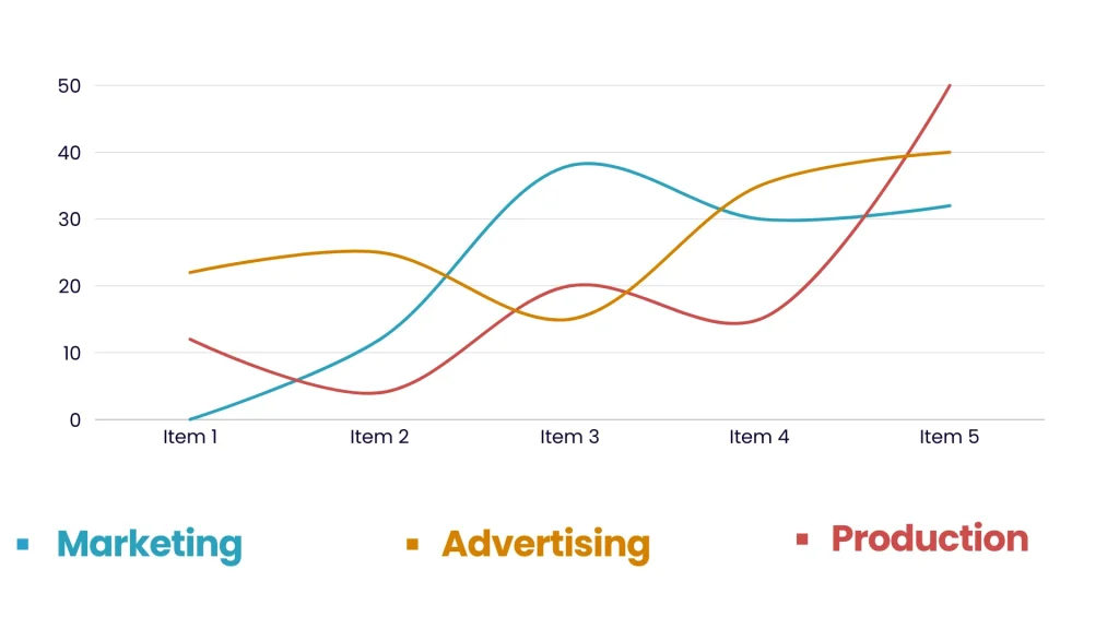
A line graph illustrates a singular trend while a range area graph illustrates the variation about that trend. It employs two lines to establish an upper and lower boundary (akin to the range of maximum and minimum daily temperatures or high and low values of a product), and colors the area in between.
- What it resolves: Answers the question “What’s the typical range of values, as opposed to the mean?”
- Why it is valuable in Zoho Analytics: This is great for depicting SLA compliance, SLA compliance, fluctuations in inventory levels, or the even the distribution of time taken to complete a project. It provides a a wealth of information unlike a single line could ever capture.
6. The Multi-Axis Line Chart: Comparing Different Scales
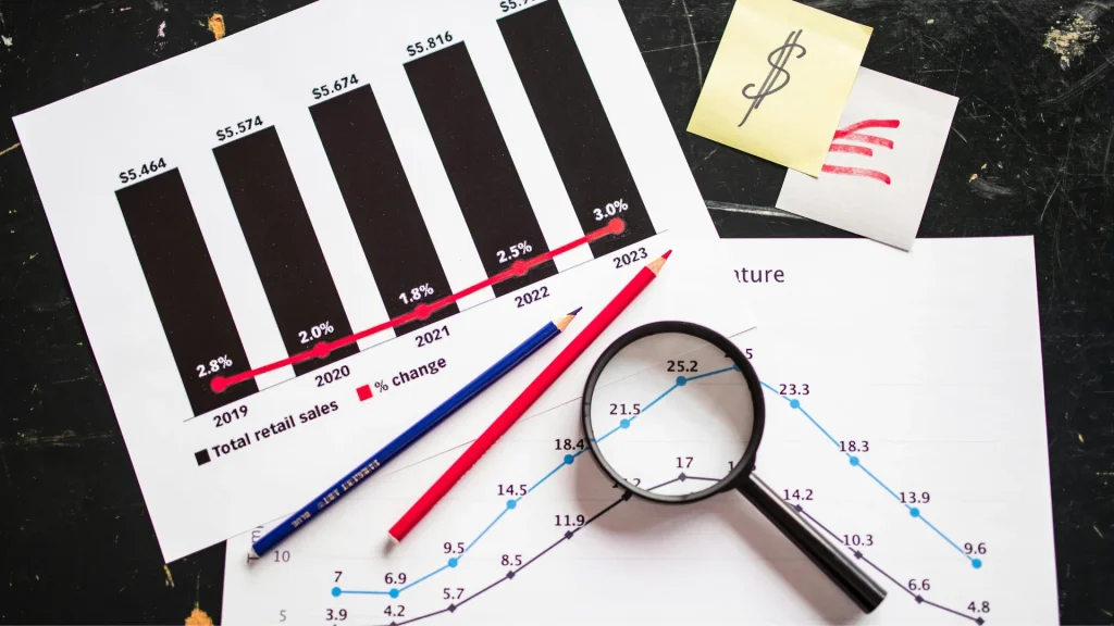
At times, it is necessary to compare two metrics whose scales are drastically different. For instance, attempting to overlay website traffic (in thousands of visits) with conversion rate (in percentage) is easier done than said.
- What it solves: The question “Is there any causative linkage between these two highly disparate measures?”
- Why it’s useful in Zoho Analytics: The Chart with Multiple Axes allocates distinctive vertical scales for each measure on the left and right side of the chart and can identify potential correlations relatively easily, such a delta in marketing dollars spent (axis one) marketing dollars spent on (-) new customer acquisition (axis two).
7. The Multi-Axis Combination Chart: The Best of Both Worlds

This takes the previous idea a step further. It lets you combine different chart types on different axes. You could have a column chart for monthly sales (on one axis) and a line chart for the profit margin percentage (on the other axis).
- What it solves: The question, “How do these different types of metrics relate to each other within the same time period?”
- Why it’s useful in Zoho Analytics: It’s the ultimate tool for creating a comprehensive business snapshot. You can tell a complex story in a single, cohesive view, making it incredibly powerful for executive dashboards.
Why This Matters for You (Beyond Just New Charts)
Due to the powerful features combined with its ease of use, Zoho Analytics has always been a well-regarded contender in the realm of business intelligence. It integrates with a multitude of data sources, not only the Zoho applications. These include Google Drive, QuickBooks, and more. It also allows different teams to collaboratively work on the same dashboards. These new chart options continue to demonstrate that Zoho is still heavily investing on providing a more comprehensive business intelligence tool.
The Bottom Line
If you’re already using Zoho Analytics, these new charts are a free upgrade to your storytelling toolkit. I’d encourage you to open a report and play with them. You might find a new, better way to look at your old data.
Of what I’ve seen, this seems to be one of the few instances where the creation of an AI has enhanced the utility of visual storytelling—closing the gap between story and data. Every narrative a data set has to offer, be it simplistic or intricate, can be effectively communicated with the tools that have been thoughtfully integrated into the Interface. Zoho has placed great emphasis on narrative data integration and subsequently reduced the stress and friction between an analyst and the interpretation of data. Analytics like this should be thought of as a bridge between vision and visualization.

