
This is the point where a decent analytical tool is a necessity. It can depict the figures and answer you them visually. And if you are using a tool like Zoho, then that visualization of data just got a whole lot easier and with more dimensions to play with. This is also because Zoho has introduced 7 more new types of charts in its visualization toolbox. It’s not just about having more items on a toy shelf. It is more about knowing which tool to use and in which situation. Take for instance a bar chart, sometimes a more simplistic chart is more effective in getting a point across, but you have all the more options to also to have the data processed, fast and correct.
Struggling to turn dashboards into business decisions? Our services can help you implement smarter analytics workflows and build reporting environments that make data easier to understand and act on.
Transform Scattered Numbers into Executive Strategy
Stop guessing and start leading with real-time business intelligence. Learn how our custom visualization frameworks save teams up to 10 hours every week.
Let’s have a look at these visuals. There’s a lot of technical jargon so I will tell you what each is meant for so you can tell out of the whole collection which is more suited to the task at hand.
The Gantt Chart: For When Time is of the Essence
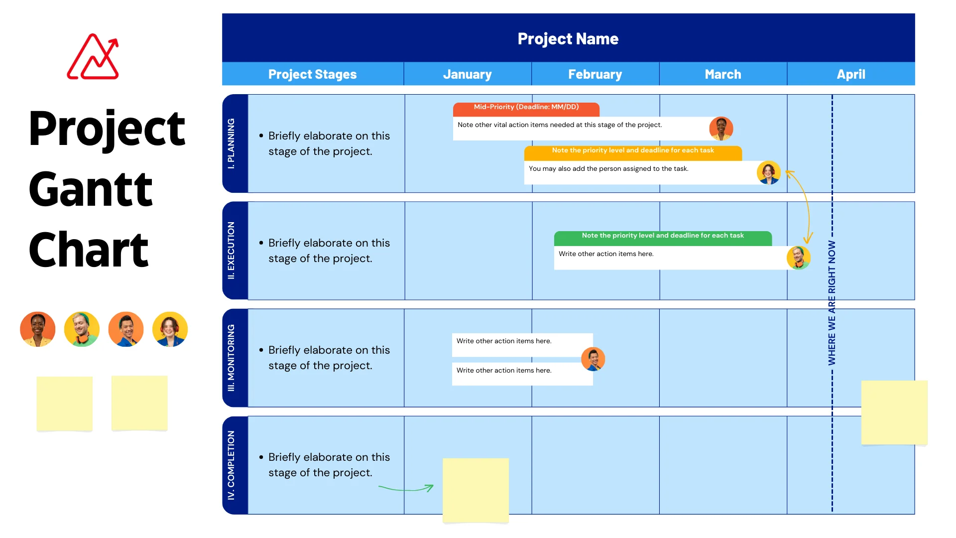
If you’re managing complex projects, standard tables won’t cut it. A Gantt chart maps out your entire schedule visually, letting you track milestones, dependencies, and progress effortlessly. This is particularly valuable when planning a major platform shift, such as a Zoho CRM migration, where multiple milestones must align perfectly.
Comparison of Core Visualization Charts
| Chart Type | Best Used For | Key Metric Displayed |
|---|---|---|
| Gantt Chart | Project management, milestones, and implementation roadmaps. | Time-to-completion, dependencies. |
| Bar Chart | Comparing discrete quantities across categories. | Volume, counts, and financial totals. |
To give you an idea of how your resource allocation and milestone timelines can look when building a clear roadmap, here is a clean, modern design visualization:
Project Milestone Progress Tracker
100% Complete
75% Complete
20% Complete
Whether you are tracking tasks internally or building out an enterprise architecture using advanced Zoho Analytics reports, mastering these new views helps clarify operational deadlocks instantly.